01 / WORKRate Filter
Designing confidence in mortgage search
A UX audit and redesign of a mortgage comparison platform in beta, making complex rate data clear enough for first-time buyers to act on.
- Client
- Rate Filter
- Year
- 2024
- Role
- UX audit and redesign, senior UX/UI designer
- Sector
- Fintech, mortgage comparison
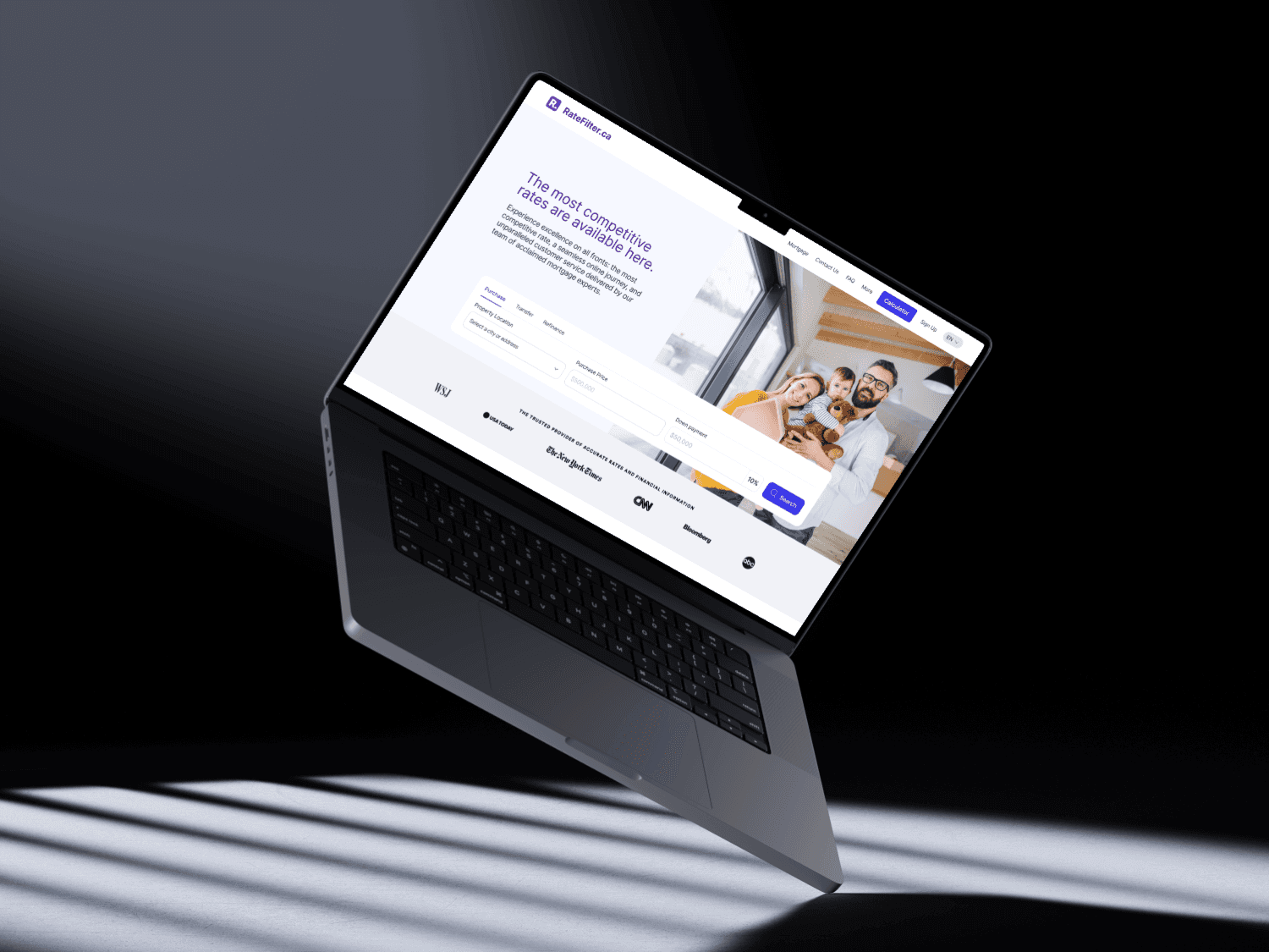
Problem and key outcomes
THE PROBLEM
Rate Filter compares mortgage rates from many lenders. In beta, the data was complete but hard to trust and hard to filter, especially on mobile.
- +15%quote requests and lender referrals
- +25%average session duration
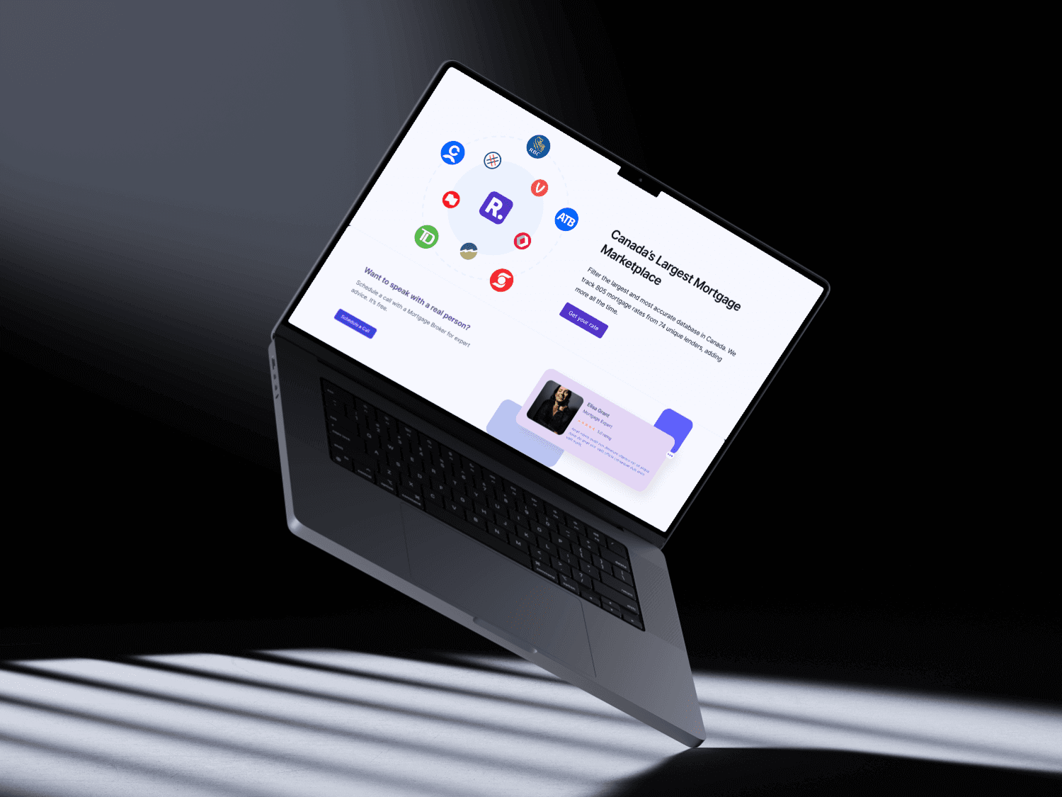
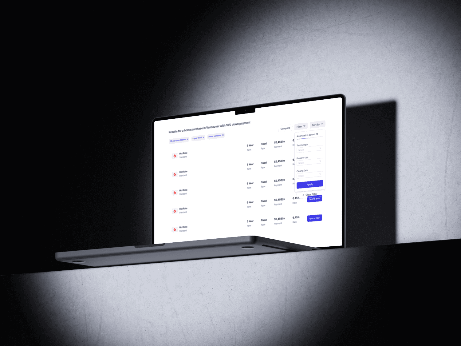
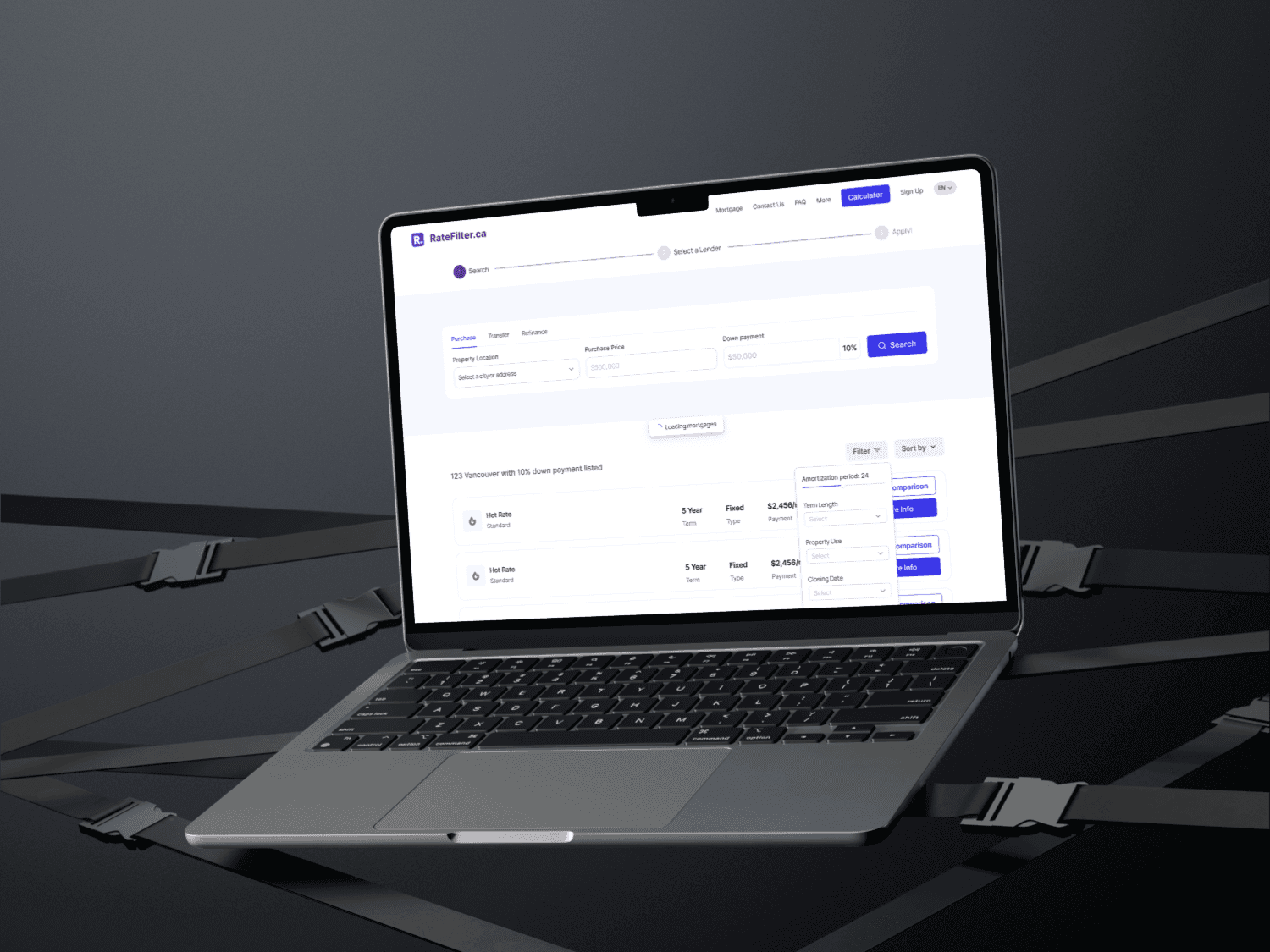
Key flows & screens
The challenge
Mortgage comparison asks a lot of people at an anxious moment. Rate Filter, a platform that compares mortgage rates from multiple lenders, was in beta and had four problems to solve at once:
- Simplify complex mortgage data without hiding what matters.
- Build trust in a new financial platform.
- Make filters intuitive and flexible enough for very different needs.
- Deliver the same clarity on mobile as on desktop.
Research and audit
I started with a UX audit of the live beta to find where people hesitated, misread or gave up. Alongside it I analyzed competitor platforms and user behavior data to separate real pain points from preferences, then defined the key user flows and audit goals together with the business objectives, so every recommendation could be tied to an outcome.
Design and prototyping
I worked with the design team to rework the interfaces and interaction flows the audit flagged, moving quickly through low- to mid-fidelity mockups. Changes were validated through stakeholder feedback and usability testing insights before they went to development.
What changed
Intelligent search
Results are shaped by each person’s profile, preferences and financial goals, so the first offers people see are the relevant ones.
Real-time rate comparison
Live integration with multiple lenders means the rates on screen are current, and offers can be compared side by side with confidence.
Personalized filters
Customizable filters for loan term, rate type and lender let people narrow the market to what fits them, without needing to know the jargon first.
Delivery
I prioritized the UX improvements with product, development and marketing, and supported rollout in agile sprints with design documentation and audit recommendations. Accessibility and responsive best practice were checked as part of each release, not after it.
Outcomes
- +25% session duration as people explored options more confidently.
- +15% quote requests and lender referrals after redesigning key flows, sharpening calls to action and removing friction.
- Steady growth among first-time homebuyers and people refinancing.
- Higher satisfaction with clarity and ease of use, more time on comparison pages, a lower bounce rate, and better retention and return visits during beta.